As shown here, here, here and here, it is very useful to see results that are below threshold in FMRI data. This has been a part of AFNI and the afni_proc.py's QC HTML report for a long time.
What is new (as of AFNI_25.2.11), is that the colorbars below the transparently thresholded images themselves now reflect this more helpfully. This comes in two flavors:
-
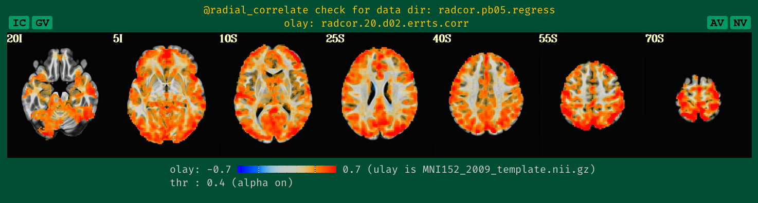
when the overlay and threshold data are the same, then any threshold value will be represented by a dashed line across the colorbar. Additionally, if transparent thresholding is on (which it will often be), then the fading of the color values will be shown within the colorbar itself. Two examples of this from the APQC HTML specifically are shown below the image montages here (first image is an F-stat, which is one-sided, and the second is a correlation, which is two-sided):
-
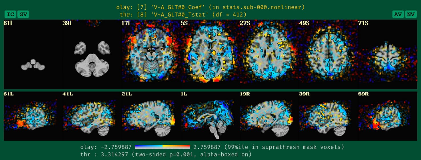
When the overlay and threshold data are different, then the fact that transparent thresholding is on will be shown with a progressive fade that stretches all along the colorbar, orthogonal to the color gradient. An example is shown here:

This should help clarify the colormapping more clearly.
This is all implemented internally by afni_proc.py and QC generating functions making use of this program, colorbar_tool.py.
--pt