AFNI version info (afni -ver):
AFNI version=AFNI_24.1.17 (Jun 12 2024) [64-bit]
Hello,
I'm plotting some clusters and I'm having some doubts regarding 1) what values I'm actually plotting and 2) if this is correct.
In short:
-
I run a 3dlmer model on my dataset to detect differences in sound processing between two groups of participants
-
I thresholded my data with 3dClustSim (min cluster size = 15) and p=0.05. I displayed my -gltCode contrasts in Afni thresholding with Zvalues
-
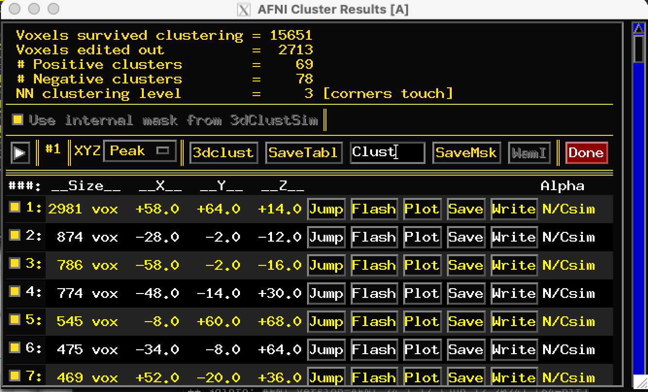
I saved the clusters from the afni gui clicking on button "write" on the "Rpt" window (see screenshot). I then ran 3dinfo to check the range of values and saw that it was always between 0 and the number corresponding to the number of the cluster (for cluster n 14, values range from 0 to 14 and so on). So I suppose I saved some kind of mask of my cluster....(?):
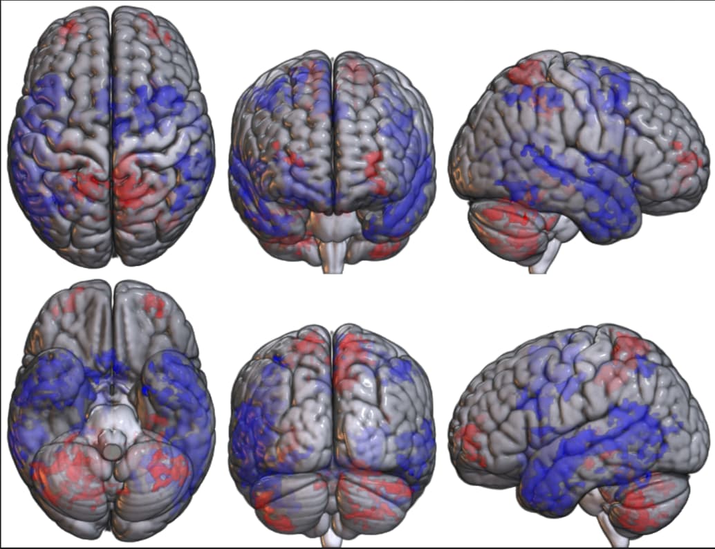
- As I don't necessarily care about the range of values inside each cluster, but I care about the direction of the effect (i.e., which regions showed increased or decreased activation in group 1/2), I divided my clusters into positive and negative based on the values in Afni and then plotted them in MRIcroGL, something like this:
Here, i plotted a contrast group1-group2, so blue denotes decreases for Group1 and red increases.. This offers an intuitive understanding of the difference between the groups.. But I suppose that this way of displaying my results is not correct, since I have basically plotted the cluster masks in red when they are positive and in blue when they are negative...
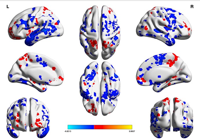
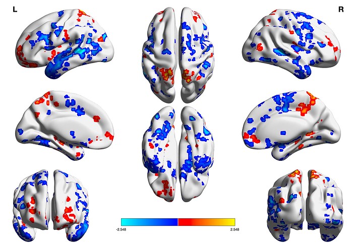
Can someone help me and explain to me how to plot (1) gltCode Z-statistics of multiple clusters on the same template without having a different colorbar for each cluster?
Thanks a lot in advance for your help and time..
