Hello,
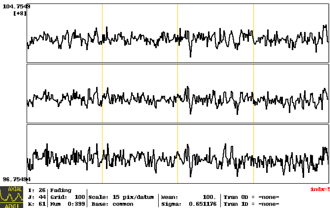
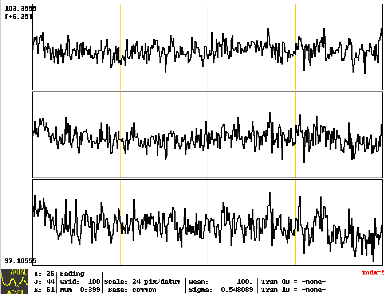
I would like to visually compare the BOLD time course from the same voxel of two runs using an identical y‐axis scale. The inputs are the pb0x_*_scale datasets. Although I locked the data range and val in the “Define Datamode” settings, run 01 displays 15 pix/datum and run 02 displays 24 pix/datum. Does this mean the two time courses are being plotted with different y‐axis ranges? Could you please show me how to plot these two underlay time courses from two runs using the same y-axis scale? Thank you very much.
run01
run02
Hi, Zhengchen-
How about plotting them on the same graph window with each other,using different colors?
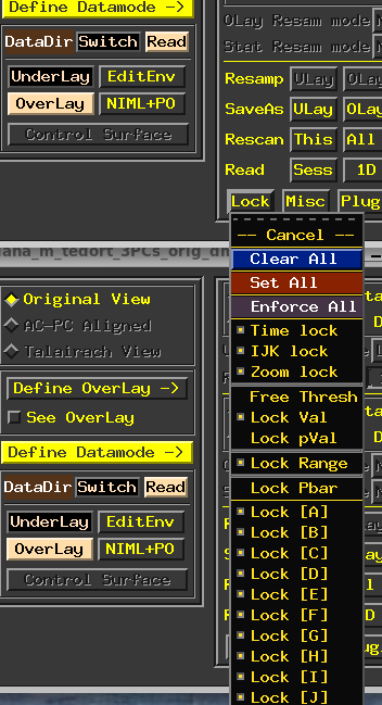
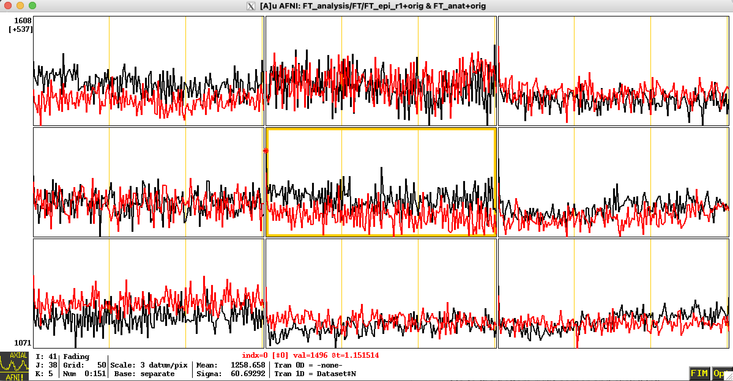
Make one time series the underlay, and open a Graph window.
- Go to the bottom-right corner and click 'Opt'
- Go down near the bottom of the menu, to "Tran 1D" and change "none" to "Dataset #N" (this is to allow to have N extra 1D plots added to the graph window)
- In the new menu that opens, click the yellow box by "Input #01" to activate it, and use "Choose dataset" to pick your new other dataset to display
- You can select a particular color for it in the menu panel, too, if you want
- Select either "Set+Keep" or "Set+Close" to make the update to the graph (either leaving the menu open or closing it, respectively)
After that, your newly added dataset's time series will appear on the same graph in whatever color you have chosen/used, with the same y-axis range:
NB: I assume your 4D datasets being plotted are on the same grid to start with? Otherwise, I guess there would be inherent resampling or something.
--pt
Hi Paul,
Thanks a lot. This is even better, I don’t need to resample.