I have FMRI data, and was wondering how to show more than one "ideal time series" at a time?
--pt
I have FMRI data, and was wondering how to show more than one "ideal time series" at a time?
--pt
Hello-
OK, I think the AFNI GUI can do that.
I'll use the Bootcamp data, from processing hte aud and vis task data in AFNI_data7/task_demo_ap, and using 2 ideal*.1D time series that are output in the *.results directory from running afni_proc.py. Each of these have 450 time points, and go with the datasets outputs in the regress block of AP processing.
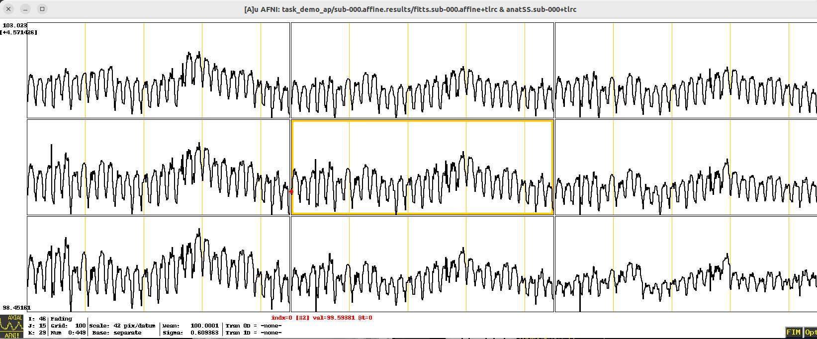
In this case, I will load the fitts* dataset as the Underlay data, and open up a Graph window. In particular, I've jumped to this XYZ coordinate: -20 94 -4 (in the default RAI DICOM notation). The data looks like this:
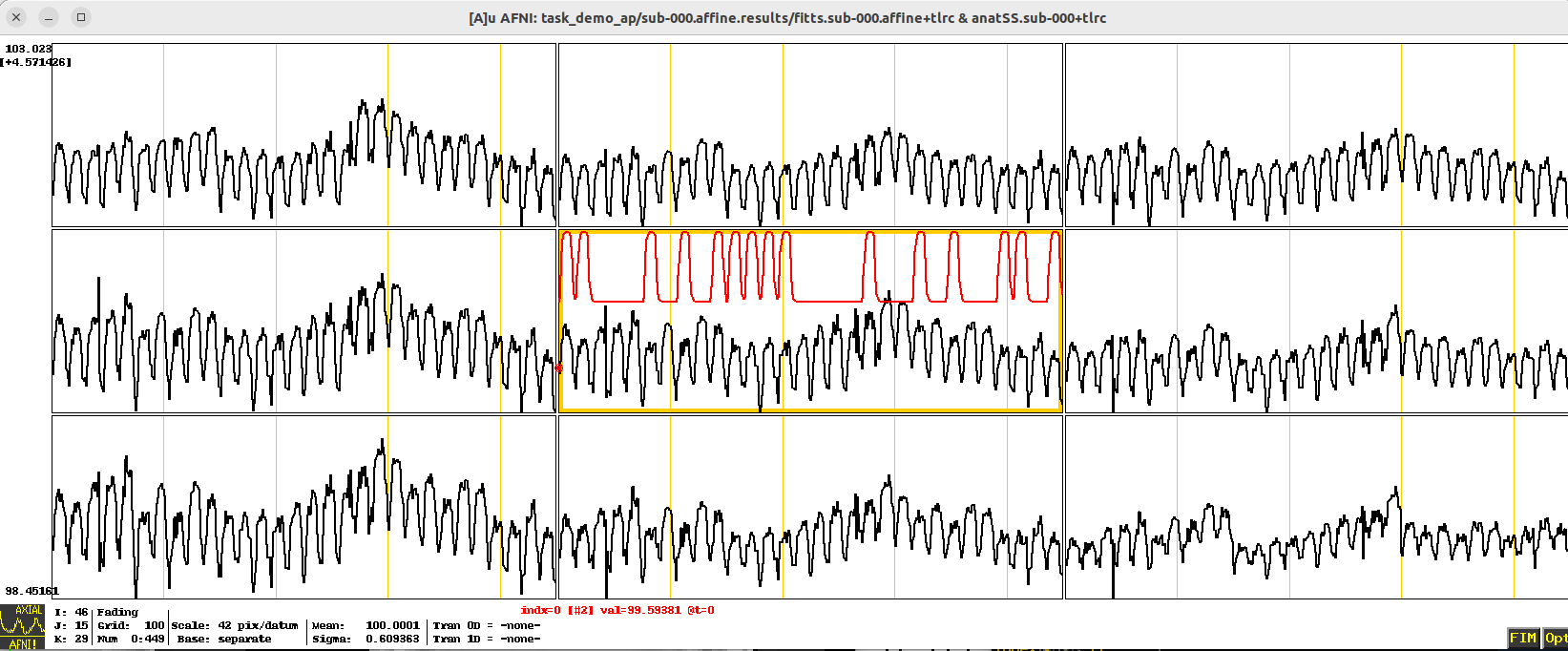
The 2 ideal time series files I want to load are: ideal_aud.1D and ideal_vis.1D. In the lower right of the image window, I can click FIM -> Pick Ideal, and then choose one of these to load. If I pick ideal_aud.1D, The result looks like:
That's great, but I was both time series loaded!
As far as I can tell, the best way to do this is to:
To do the first job, I found it convenient to use the following terminal commands, to concatenate multiple column files, and also make sure they are each vertically aligned well:
paste ideal_aud.1D ideal_vis.1D | column -t > ideal_ALL.1D
This makes a new, multicolumn file called ideal_ALL.1D. The above works with any number of coluimn files. The first few lines can be displayed, looking like this (the second column should indeed start with all zeros here, so great):
$ head ideal_ALL.1D
0           0
0.0526548   0
0.37117     0
0.714956    0
0.900383    0
0.970763    0
0.992416    0
0.998211    0
0.999616    0
0.999932    0
To do the second job, you can use the AFNI environment variable AFNI_IDEAL_COLORS, whose description is:
AFNI_IDEAL_COLORS (editable)

    This variable, if set, allows you to specify the set of colors used
    for the FIM Ideal overlay in the graph viewer window. Separate color
    names by colons, as in "red:green:blue". The first column in the
    Ideal 1D file gets the first color; the second column gets the second
    color, and so on. The variable AFNI_ORT_COLORS can similarly be used
    to specify the colors for the FIM Ort overlay.
So, you could do one of the following to set it:
setenv AFNI_IDEAL_COLORS red:blue:green:violet:orange:rbgyr20_03
export AFNI_IDEAL_COLORS=red:blue:green:violet:orange:rbgyr20_03
~/.afnirc file, you could put this line:AFNI_IDEAL_COLORS = red:blue:green:violet:orange:rbgyr20_03
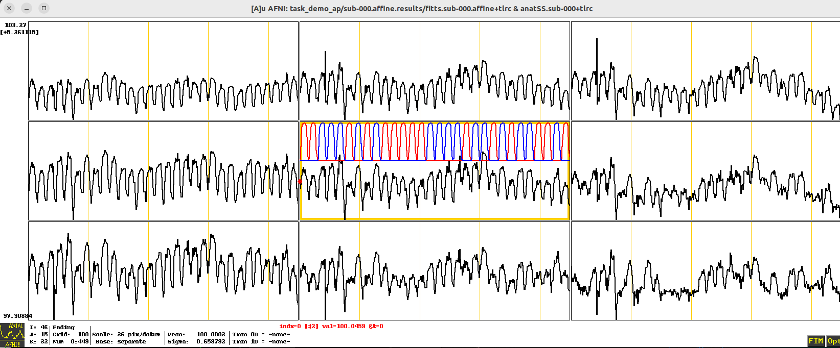
After doing one of those things, I fired up afni, chose the same underlay and location, and in the lower right of the Graph window selected FIM -> Pick Ideal -> ideal_ALL.1D. And I got this nice colorful image with my multiple ideal time series:
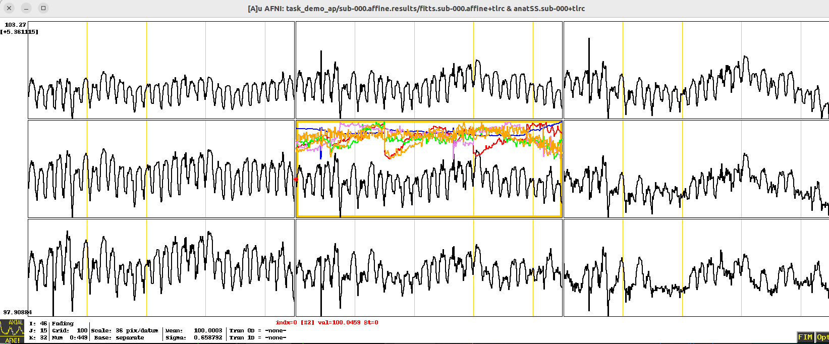
If my ideal had more columns, I would get lots of colors (here, I'm choosing a motion_demean.1D dataset, just to have something with 6 columns):
If my ideal had more columns than colors that I had provided, the last color will "stick" for columns that outnumber the number of colors.
Hope that is helpful!
--pt
There is a simple way to show two (no more) 1D timeseries as color overlays in the graph window. Use the FIM menu button to 'Pick Ideal'. Then use 'Pick Ort' to choose a second file.
Now, the 'Ort' is shorthand for a nuisance time series regressor, not an ideal. For the purposes of looking at the curves, though, it doesn't matter what the function of the 'Ort' vs. 'Ideal' is -- you can see both of them this way.
The National Institute of Mental Health (NIMH) is part of the National Institutes of Health (NIH), a component of the U.S. Department of Health and Human Services.
Freedom of Information Act |
HHS Vulnerability Disclosure
National Institute of Mental
Health | National Institutes of Health | U.S.
Department of Health and Human Services |